This is a slightly adapted version of the talk that I gave at Pixel Pioneers in Bristol on 14 June 2024. It's basically the same content, just some of the preamble has been removed. Of course, in the talk I started the videos when needed but you'll need to start these for yourself.
Less 'Help', More 'Yelp': When Accessibility Enthusiasm Actively Harms
Having undertaken many a web accessibility audit in my time, I've seen a few sights, it's true to say. And while this normally means inaccessible sites (such as no keyboard support, terrible contrast, no alternative text—you know, the ususal suspects), I also see a lot of examples where the developers have 'had a go'. By that I mean that they have clearly picked up an idea or two about accessibility along the way and have shown some enthusiasm to make things right. But as the saying goes, a little knowledge is a dangerous thing.
Some of the mistakes I see are down to misunderstanding of when it's appropriate to take a certain approach—because context is everything‚ and sometimes it's a misunderstanding about how assistive technology users navigate and access site content. What I'll be doing here, then, is running through some typical examples of over-enthusiastic, but slightly misguided, attempts at making a site more accessible.
I absolutely do not want to discourage any developer from making things more accessible, but there is definitely a need to do some course-correction here and there.
Sausage time!
Anyway, let's get this started. And I'm going to start unconventionally by showing you a sausage.
Here it is!

Do you recognise the cartoon sausage above?
Hang on, this is all terribly sightist of me, isn't it? Perhaps not everyone can see this sausage. So here's an audible clue for those not currently enjoying the view.
Sounding familiar?
From sausages to chicken
That's 'Chicken Man' by legendary library musician Alan Hawkshaw. In case you are not aware of library music, this was music performed by session musicians that broadcasters could use for TV shows. Think of it like the audio equivalent of stock photography. And the TV show it was used on was 'Grange Hill'. And that sausage is, of course, the one that flies in to view in the opening credits. Oddly, a version of Chicken Man was also used on the TV quiz show 'Give Us a Clue', briefly:
Why the hell am I prattling on about this? It's got nothing to do with accessibility ... I just ended up down some rabbit holes while prepping this and felt the need to share.
WTF are you referencing, old man?!
Why the heck am I referencing a TV show from 40 years ago? There's something that has stuck in my head from those days and it revolves around this girl and this guy:
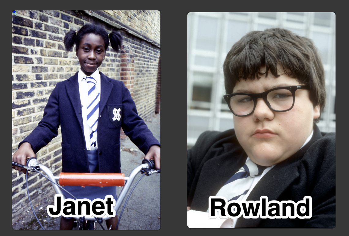
Janet St Clair and Rowland Browning. For the old farts in the house, what catch phrase comes to mind?
Trying to help
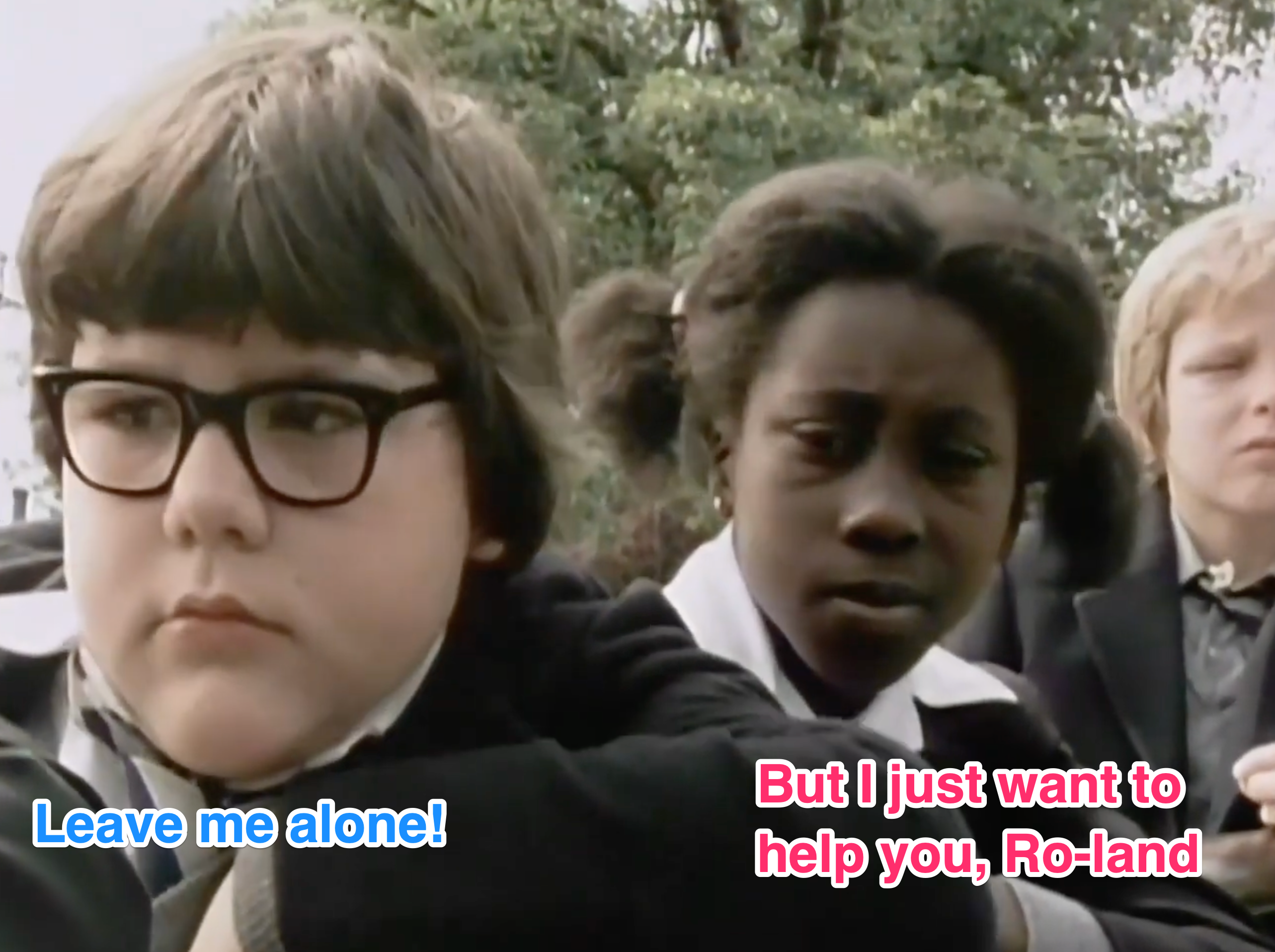
Janet St Clair appointed herself as Roland Browning's friend, counsellor and advisor, but ultimately became a total annoyance and frustrating presence for Roland. And some of the 'help' that developers provide to enhance accessibility land in a similar fashion with assistive technology users, but by the end of this I hope to have pointed out some of these bad habits.
Don't be like Janet.
What I'll be covering
I'm going to be covering issues that fall in to the following three topics:
- Naming and Shaming - How you can accidentally go overboard with naming elements
- Picture Imperfect - How to handle alternative text for images
- What the Focus? - Understand how AT users navigate a page and how it doesn't mean making everything focusable
Let's dive right in now.
Naming and Shaming
Overriding the Default Accessible Name
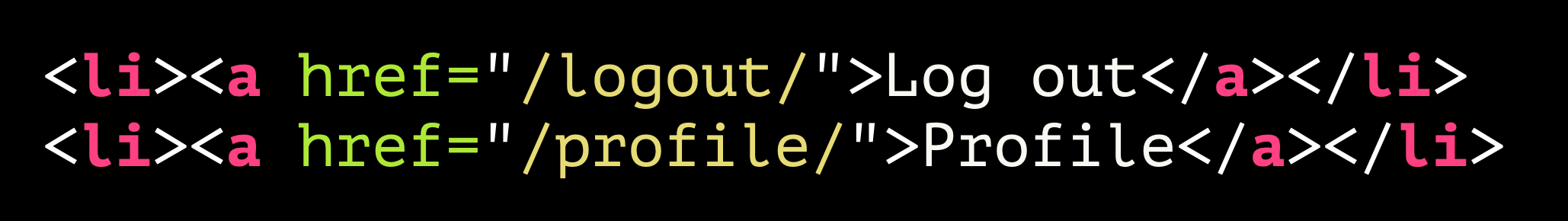
Let's start with a simple log out link. Here's a perfectly good one right here:
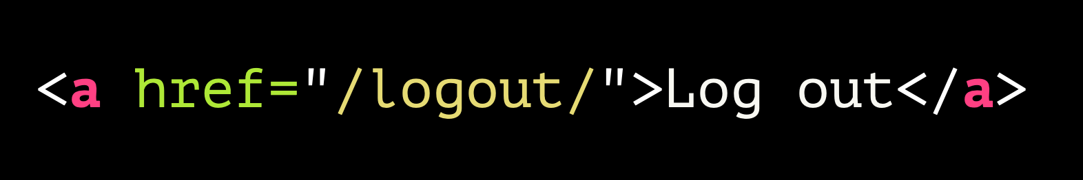
<a href="/logout/">Log out</a>
It uses the correct markup, has a nice clear accessible name of 'log out'. So what could you do to break this?

<a href="/logout/"
aria-label="My account">Log out</a>
This is the kind of thing I see a lot. The 'Log out' link has been given an aria-label of "My account". The intention here was to provide additional information: that this link will log you out of your account. Not that it's really needed or helpful, mind. What else will it log you out of?
The problem is that the aria-label is not providing additional information. In fact, that aria-label overrides the default accessible name of "Log out". Why is this a problem? Let's demonstrate that with a couple of videos. First of all, we'll put ourselves in the shoes of a blind screen reader user.
So, we heard a control announced as "My account", we tried to activate that and then found ourselves kicked out of the application. Not exactly helpful!
Now let's try this again. This time we'll try to experience it from the point of view of a sighted user who has mobility issues which means they cannot use a mouse or keyboard to navigate. For this example, we'll be using dictation. How do you activate a control? As the saying went in Catchphrase, you gotta 'Say what you see'.

A voice control user's experience
So here's our user Jeff, who is a quadriplegic and can neither use a mouse or keyboard, uses voice commands.
In the video that follows, note that Jeff can see "Log out" but it's not possible to activate that control by 'saying what he sees', because that pesky aria-label of 'My account' has meant that the computer doesn't know about any control named "Log out". So it only logged out when it heard the phrase "My account". Confusing, right?
What's happening under the hood?
This is what the computer thinks is going on here:
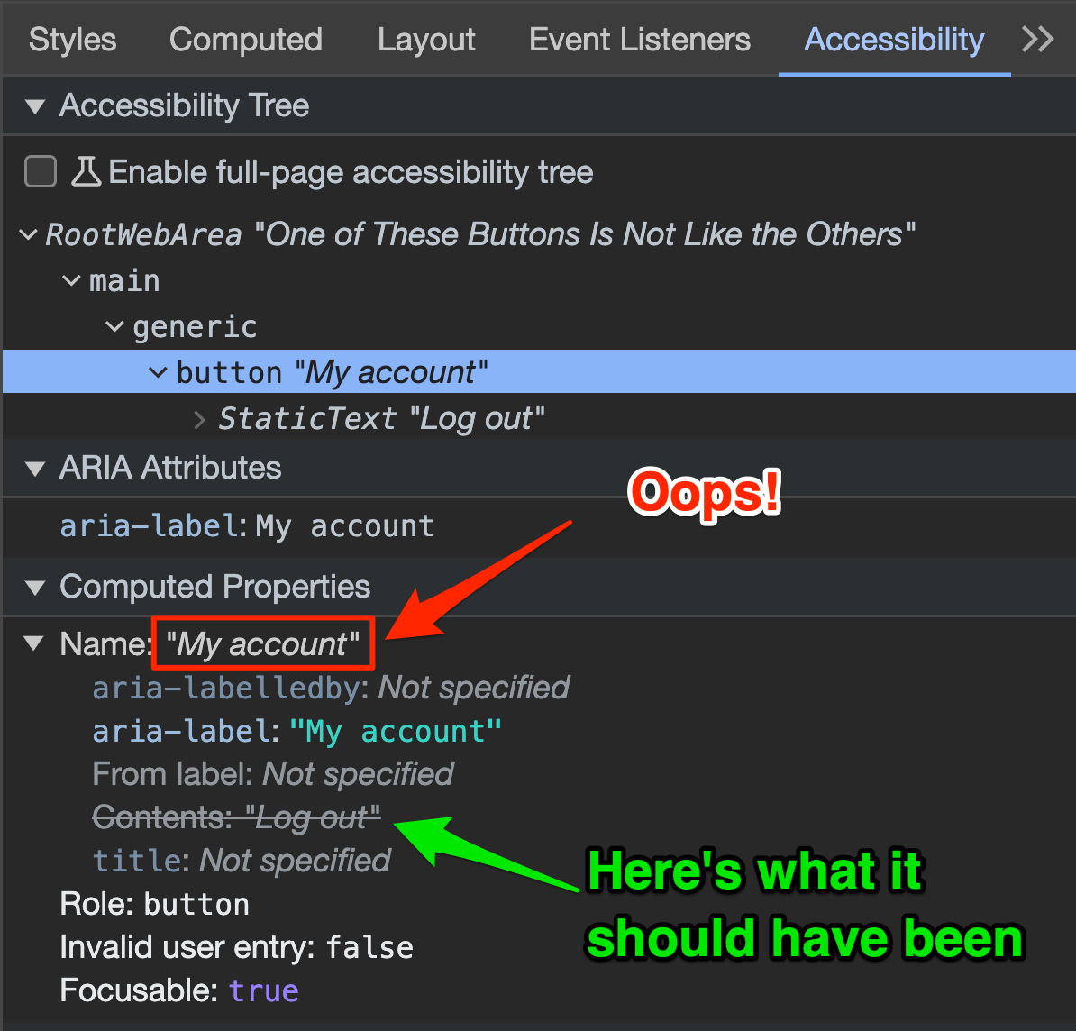
In the accessibility pane in DevTools we can see that the original accessible name "Log out", which is provided by the link element's contents, is crossed out and the accessible name now comes from the aria-label.
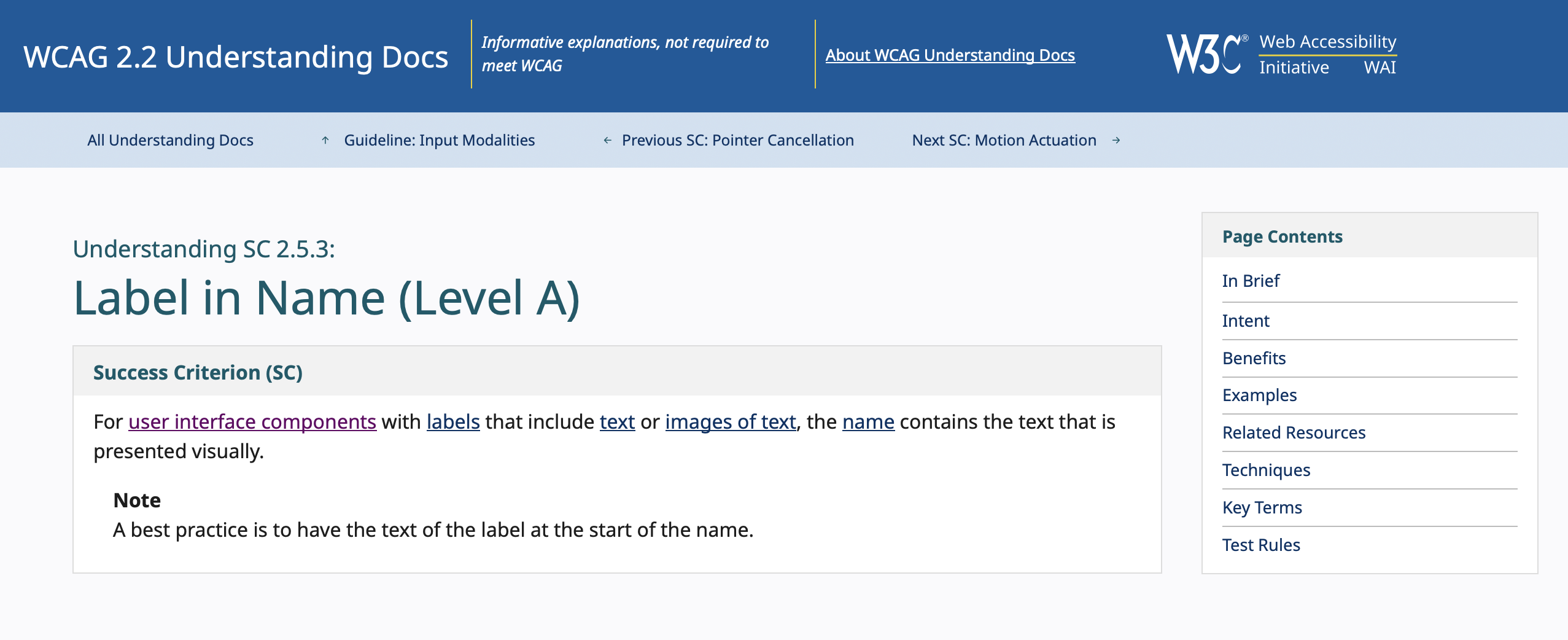
If the thing that you can see is named something entirely different, you have failed WCAG SC 2.5.3 Label in Name:
Dave's very bad day
Poor Jeff, he just can't log out. Still, it could be worse. He could be Dave. He's having a very, very bad day:
Clearly HAL is talking about a flagrant failure of SC 2.5.3 Label in Name, as this highly scientific annotated photo explains:
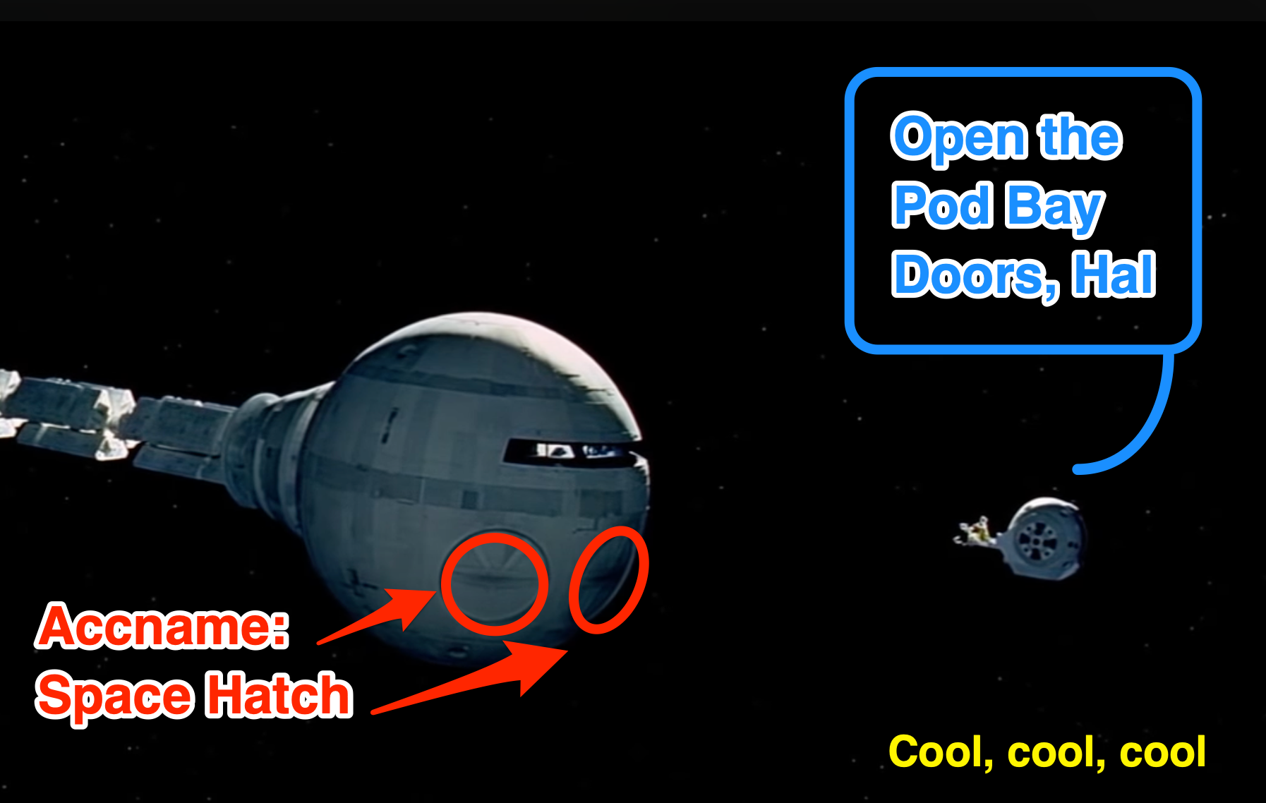
Dave is trying to open the Pod Bay Doors and HAL is all like "Dunno wot you're on about m8 - I call these my 'Space hatches'. You gotta use the right terminology, man"
Because that's how HAL talked, of course.
Say no to overrides!
So! Don't override your controls' accessible names with 'helpful' extra information
Janet: "But I'd like to help you, Ro-land."
Roland: "Well you can't!"
Well, that's not entirely true:
If we really wanted to add extra information, we can put that in the aria-label, but it MUST include the visible text in it. So with an aria-label of "Log out of my account", you provide that extra info but don't cause issues for assistive technology users. Well, apart from potentially adding to the verbosity, that is ...
Verbose Helpfulness
A simple links list
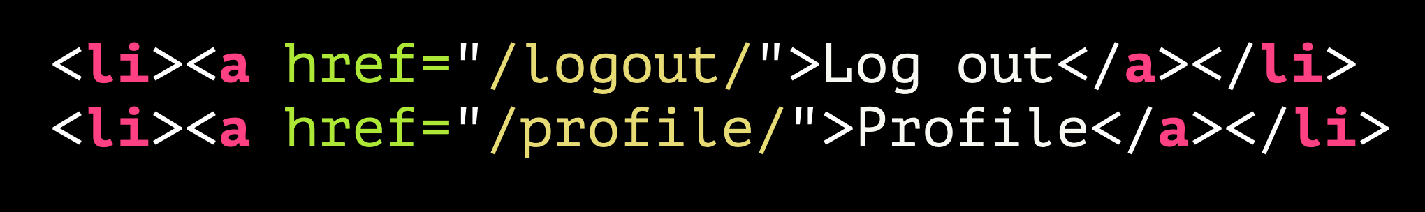
Now we're looking at a couple of links, in a list (so there could be a fair few here). The accessible names of these links are fine. Perfectly fine!
<li>a href="/logout/">Log out</a></li>
<li><a href="/profile/">Profile</a></li>
Over-egging the pudding
But sometimes people feel the need to add lots of extra information in there which is not necessary:
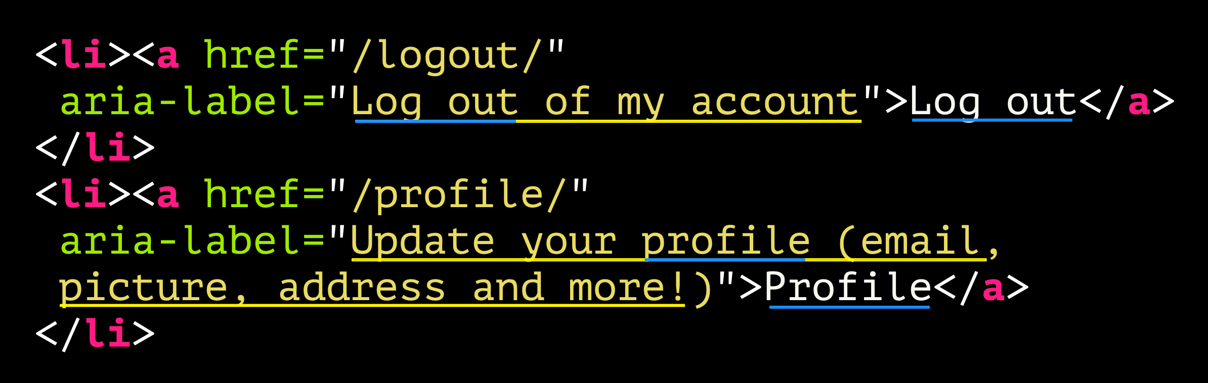
<li><a href="/logout/"
aria-label="Log out of my account">Log out</a>
</Li>
<li><a href="/profile/" aria-label="Update your profile (email, picture, address and more!)">Profile</a>
</li>
Now we have extra context provided with the aria-label attributes. The aria-label content is:
- Log out of my account
- Update your profile (email, picture, address and more!)
This time, though, there is no 2.5.3 Label in Name failure as the visible text is in the accessible name that the aria-label provides. BUT ...
It's very wordy. You might think that this is helping, but many screen reader users would disagree. You're putting up more hurdles. It takes longer to listen to the links if you're tabbing through, and if the screen reader user is bringing up a list of links on the page (as they often do), that list is going to be unnecessarily verbose too.
De-coupling that help
One option is to decouple that supposedly helpful text.

<li><a href="/logout/"
title="Log out immediately">Log out</a>
</li>
<li><a href="/profile/"
title="Update your email, picture,
address and more!">Profile</a>
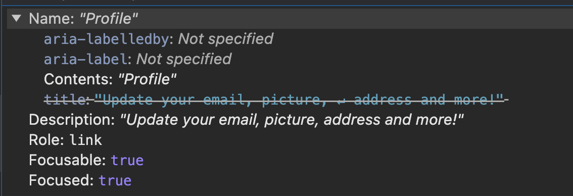
</li>In this example I have used the title attribute to provide additional context. This would appear over the element if you were to hover over it, but it also will provide an accessible description. The accessible name—which is what a screen reader user will perceive when TABbing through or bringing up a list of links—remains brief and to the point.
If we check that in DevTools, we can see that the accessible name is 'Profile' and the description is "Update your email, picture, address and more!".
How would that sound?
In the next video, note the slight gap between the announcement of the link's accessible name and the additional help text.
The title attribute? WTF?
One thing to point out - I have used the title attribute here, but you should note that title is pretty shite, generally. It's not available to a whole range of users. For example, a keyboard only user TABbing to that control won't see that text as a tooltip. So why did I provide an example using it? Mainly to be a bit of a dick about this because, frankly, I'd personally just go back to the original version and not bother with that help:
<li>a href="/logout/">Log out</a></li>
<li><a href="/profile/">Profile</a></li>
If you REALLY want users to get that additional help, do so in a way that all users can perceive.
Here's a more robust way: we put that extra help text on the page which gets shown as a tooltip when the link element is hovered or receives focus. The aria-describedby attribute in the link references the text node, thus providing an accessible description for the link.
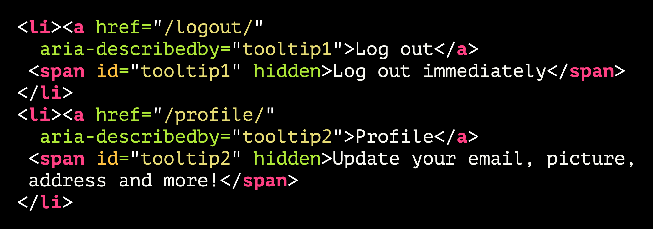
<li><a href="/logout/"
aria-describedby="tooltip1">Log out</a>
<span id="tooltip1" hidden>Log out immediately</span>
SAPs
<li><a href="/profile/"
aria-describedby="tooltip2">Profile</a>
<span id="tooltip2" hidden>Update your email, picture,
address and more!</span>
</li>
'Click Here' to Do ... Whatever
Let's go back to our two link examples again, remind ourselves what two perfectly simple links look like. Now ... what do you do with links?
<li><a href="/logout/">Log out</a></Li>
<li><a href="/profile/">Profile</a></Lli>
Of course, we click them! Better tell the users this is what you have to do, otherwise they'll be stuck, right?
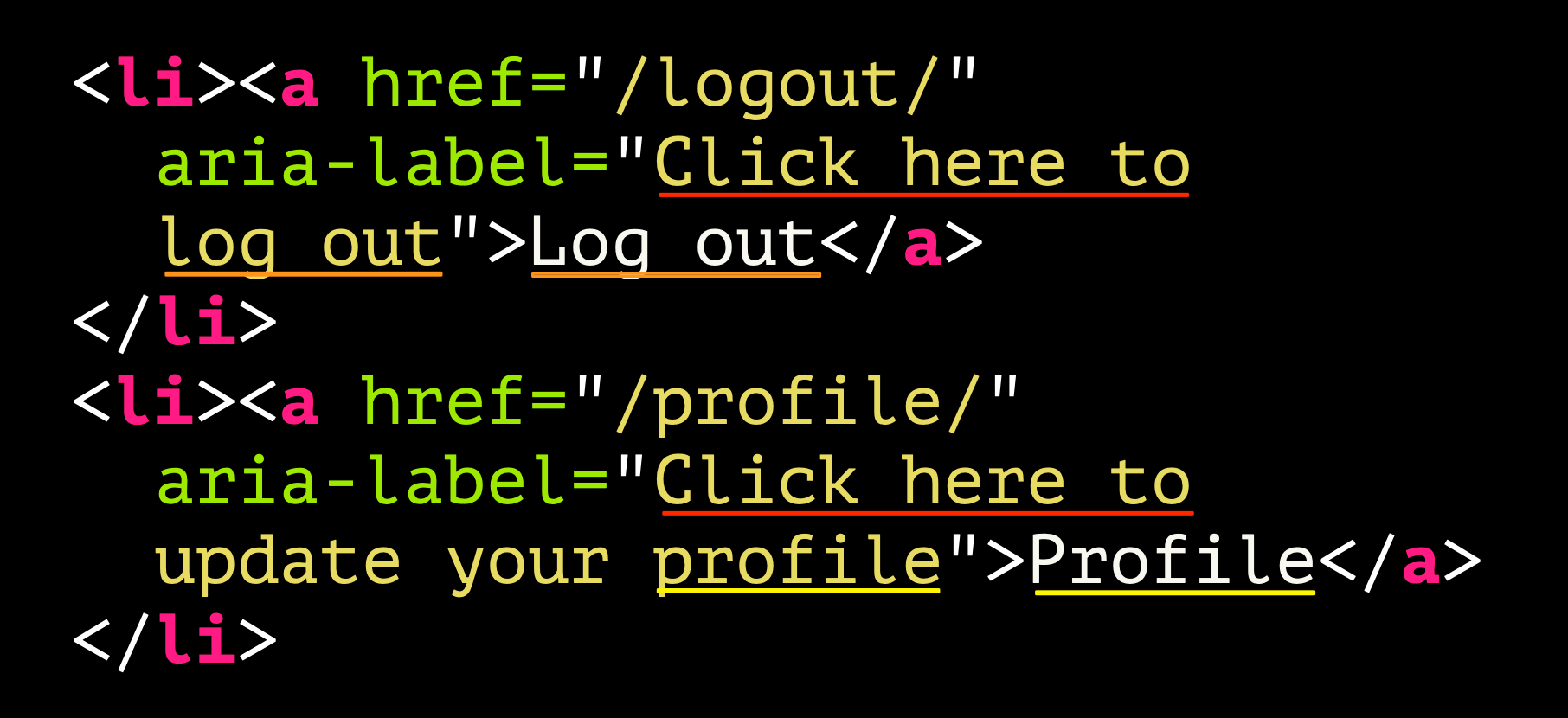
<li><a href="/logout/"
aria-lLabel="Click here to
Log out">Log out</a>
</li>
<li><a href="/profile/"
aria-label="Click here to
update your profile">Profile</a>
</li>
So yeah, I think we've established that we can click it. That's just what you do with links. So really, it helps NOBODY to add that extra 'help'. It's another example of unnecessary verbosity that will be felt most by screen reader users.

<li>a href="/logout/">Log out</a></li>
<li><a href="/profile/">Profile</a></li>
Once again, the advice here is to just NOT do the thing where you add extra 'help'. It's a link, people click them! OR ... maybe they don't? Bear in mind that not everyone will be clicking that link using a mouse. Screen reader users will actually be activating it with the ENTER key, and some users may be using physical switches.
Don't Repeat Yourself
Let's reset again and look at our two links.

<li>a href="/logout/">Log out</a></li>
<li><a href="/profile/">Profile</a></li>
And now let's see what some people like doing: adding pointless aria-label attributes that have the same info in.
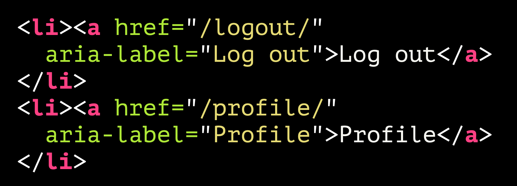
<li><a href="/logout/"
aria-Label="Log out">Log out</a>
</li>
<li><a href="/profile/"
aria-label="Profile">Profile</a>
</li>
Technically, there is nothing wrong with this. It is not inaccessible. It does not fail any WCAG SC. There's definitely an optimisation issue here though. Why have link text and then override it with an aria-label with the exact same text? That won't help with your web performance if all your links and buttons are handled like this. But there is a bigger problem that may lie ahead.
Was ist das?
Wenn ich die Webseite ins Deutsche übersetzen würde, hätten wir möglicherweise ein Problem
What I wrote there was 'If I were to translate the web page into German, we may have a problem'.
What is the problem? Should you choose to translate a web page, you might find that the text showing on screen is correctly translated, but the text in the aria-label attributes is not. And now we find ourselves in a situation where we're failing SC 2.5.3 Label in Name (Level A) again.
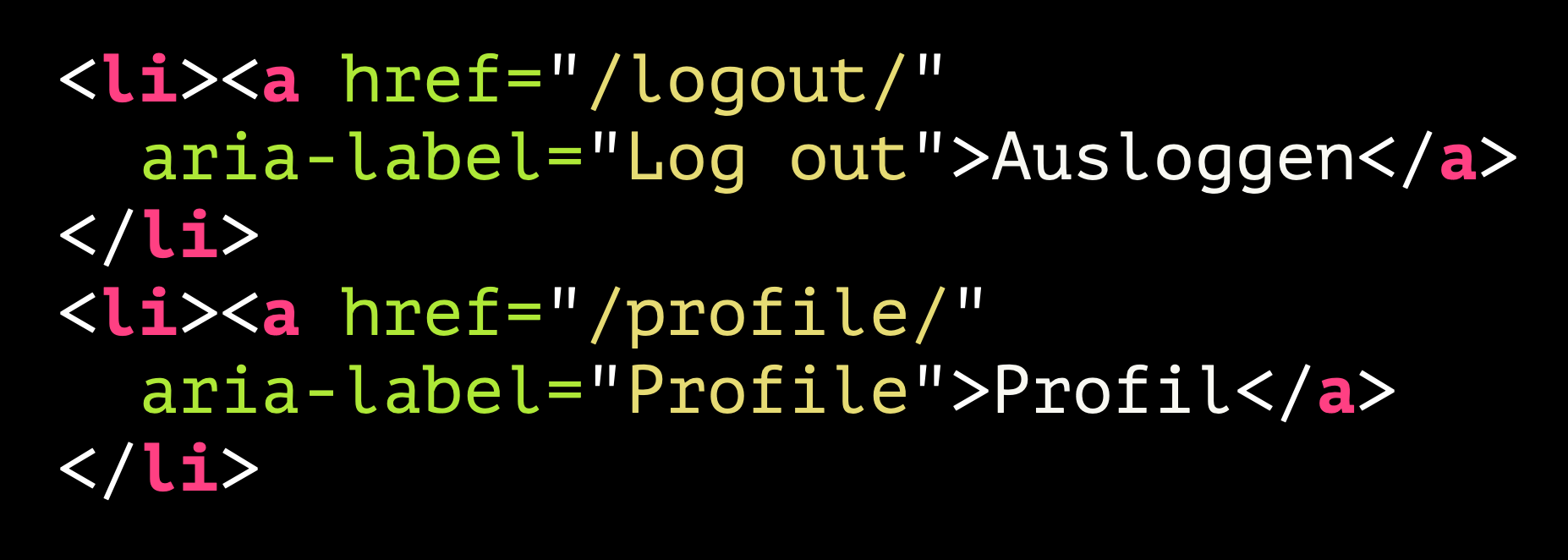
<li><a href="/logout/"
aria-label="Log out">Ausloggen</a>
</li>
<li><a href="/profile/"
aria-label="Profile">Profil</a>
</li>
Lost in translation
Here is a demonstration of this using Voice Control on macOS. Note that I cannot tap the 'ausloggen' link, and I am only able to identify the link's actual name by saying the command 'Show names':
This is something that could occur if you translate on the fly. But it can also occur if your site has localisation, through some kind of token. That visible text is easy to maintain ... because it's visible. Text that is inside an aria-label can EASILY be overlooked. I have seen this while auditing a Thai and Chinese version of a major tech brand's flagship products. All visible text was translated, but there would be occasional button or link names that were still set in English as they had overlooked the tokenisation of these phrases.
So, it's just good housekeeping - don't repeat yourself with aria-label attributes.
Picture Imperfect
It's a bit ... brief
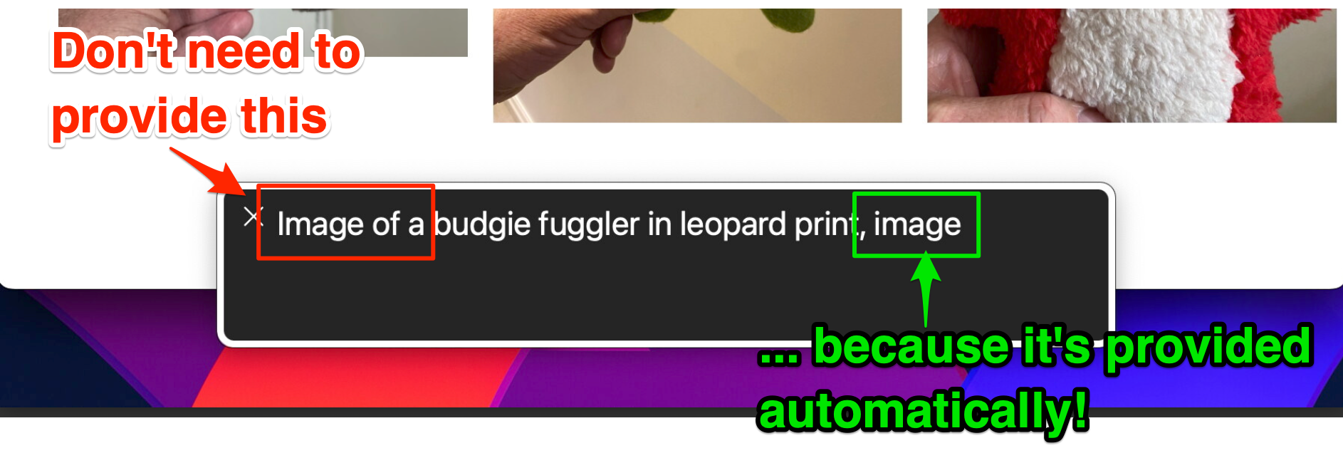
If you drop an image into a page, you should describe it for the benefit of non-sighted users, right? So this seems fine, does it?

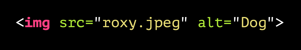
<img src="roxy.jpeg" alt="Dog">
The alt text for this is just 'Dog'. Not really telling us much, is it?
A better description
How about this instead:
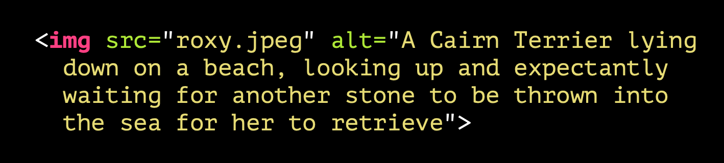
The alternative text provided now is "A Cairn Terrier lying down on a beach, looking up and expectantly waiting for another stone to be thrown into the sea for her to retrieve"
That's more like it. Not too verbose, it conveys just enough information to provide an equivalent experience for blind users. The problem is that sometimes people take the same approach with all images.
Arrows of misfortune
Let's take the example of a button that has an arrow in it, as some kind of indicator that it'll take you somewhere. The markup for it is very simple. Even the arrow itself is just an emoji character.
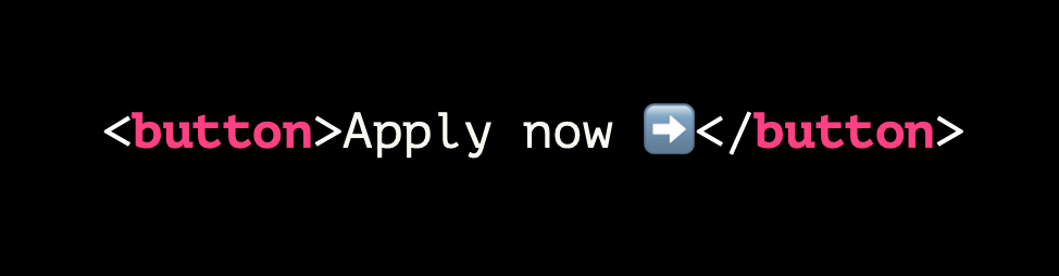
<button>Apply now ➡️</button>

This button has been styled with CSS and you should note that the emoji character renders differently in the browser from how it looks in a plain text editor.
But how does it sound?
"Apply now right pointing arrow". Hmmm. I mean, it's not terrible, but it is a little clumsy and verbose for screen reader users.
As I noted before, the accessible name is, in most cases, simply the inner text content. In this example, the symbol comes with its own descriptive text, as all emojis do, and that is exposed on the button name.
Do we care what the arrow looks like?
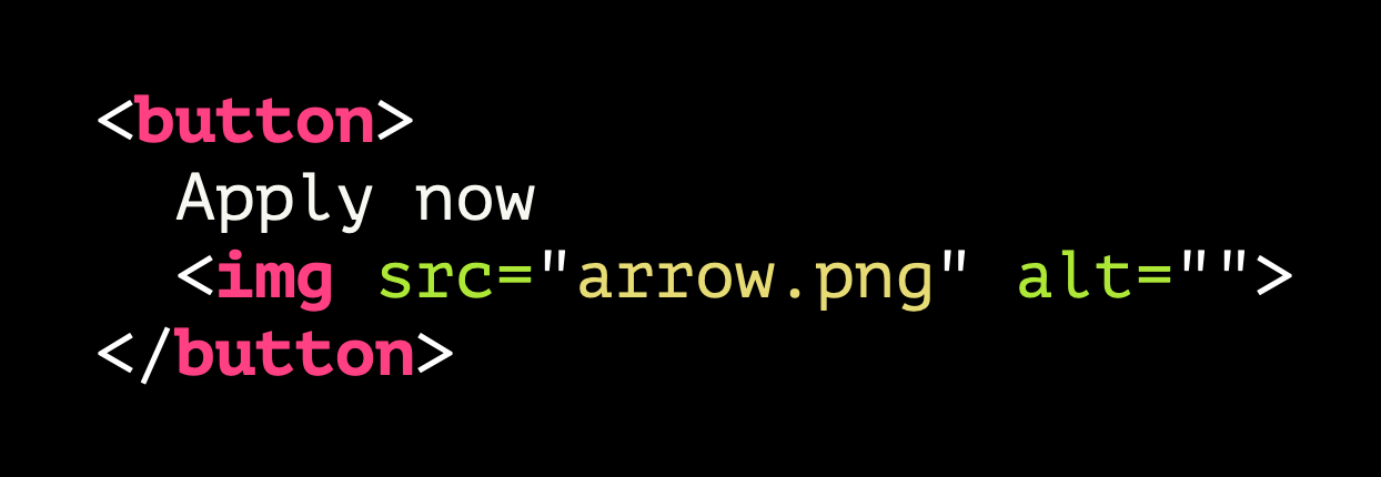
You could, for example, not use an emoji character—which does have some unpredictability about how it may be rendered across platforms—and instead use an <img>. You could override that name that is exposed by providing an alt.
But please, for the love of dog, do not do this:

<button>Apply now
<img src="arrow.png"
alt="green arrow pointing to the right">
</button>
Because then that button's accessible name will be "Apply now green arrow pointing to the right".
Yuck. Is this really what we want?
This is a classic case where, having learned that images need to be described, a developer might apply that rule across the board. But is that the right approach here?
Some things are best ignored
For an image used in this way, you really want it to be ignored by assistive technology. So just give it an empty alt attribute:
<button>
Apply now
<img src="arrow.png" alt="">
</button>
This suppresses any rogue announcement, so a screen reader user will just hear "Apply now, button"
Is this better?
Say It Again? Really?
Because it's been drummed into developers that images need alternative text, sometimes people can get a little too carried away. In this section I'm going to highlight a few examples of this. Let's start with what I'm going to call the Jimmy Two-Times problem. You remember Jimmy from Grange Hill, yeah? No, he wasn't a Grange Hill Character, you have to fast forward a few years to Goodfellas in 1990 for this reference:
Img+text link combo
This situation crops up a lot when a link is wrapped around both an image and some real text. Like this:
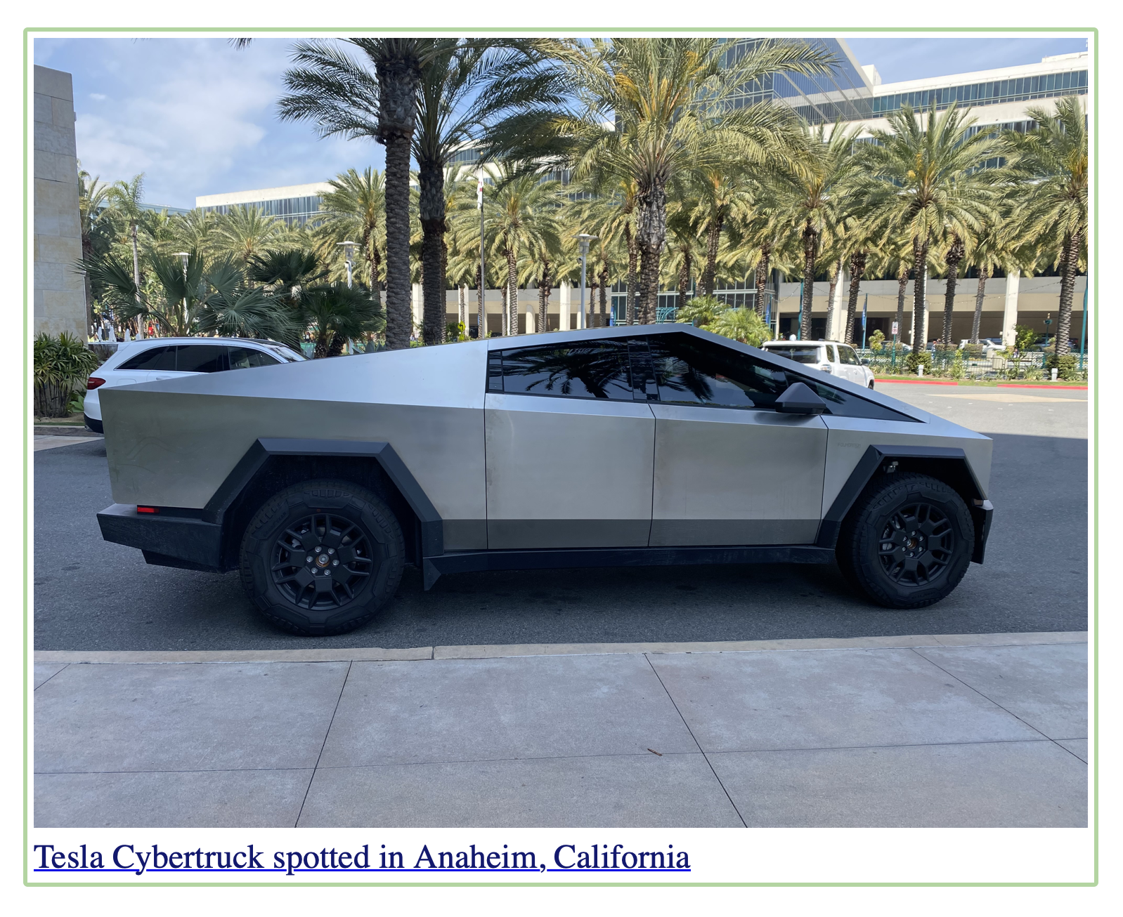
And here's the markup for that example:

<a href="tesla.html">
<img src="cybertruck.jpeg" alt="Tesla Cybertruck
spotted in Anaheim, California">
<div class="caption">Tesla Cybertruck spotted
in Anaheim, California</div>
</a>
Having had it drummed in so much that images must be described, we end up here. An image with an alt attribute that exactly matches adjacent text. You can imagine how annoying this is on pages where you have a series of thumbnails like this! And if you can't imagine, I'll try to help you here:
What's the screen reader experience?
In reality, it sounds more like this to a screen reader user:
Hide that image to AT users
So while people might think this is the correct thing to do, here is a clear example where you just want assistive technology to ignore the image. Doing so is simple:
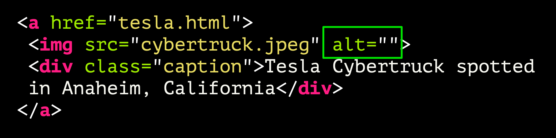
<a href="tesla.html">
<img src="cybertruck.jpeg" alt="">
<div class="caption">Tesla Cybertruck spotted
in Anaheim, California</div>
</a>
Just add an empty alt attribute. This is all you need to stop it being exposed in the accessibility tree, thus hiding it from screen readers and other assistive tech.
And for SVGs:
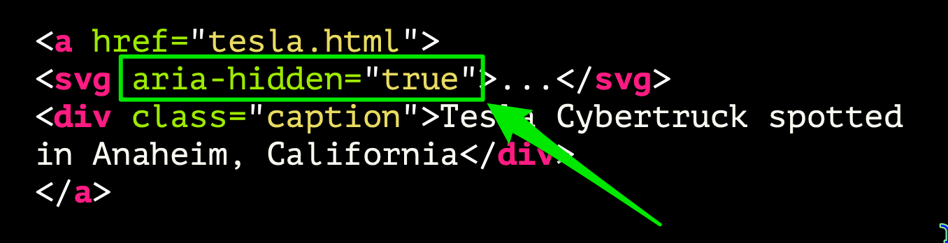
<a href="tesla.html">
<svg aria-hidden="true">...</svg>
<div class="caption">Tesla Cybertruck spotted
in Anaheim, California</div>
</a>
If it's an SVG or canvas element, you cannot use alt - that's ONLY for <img> elements. Instead you use aria-hidden="true".
Don't be like Jimmy Two Times.
Don't be like Jimmy Two Times.
What Does This Do?
Another example where "You Must Provide Descriptive Text for All Images" can have a negative effect. Sometimes people can get a little too keen with the description, and in some cases it's wholly inappropriate.
Take the example of a logo. Here's one that comes to mind:
Now, if you were trying to explain how the logo looks, you might reasonably describe it like this:
A light teal and red compass logo with the text 'PIXEL PIONEERS' laid over it. The 'O' in PIONEERS forms the central pivot of the compass' hands'.
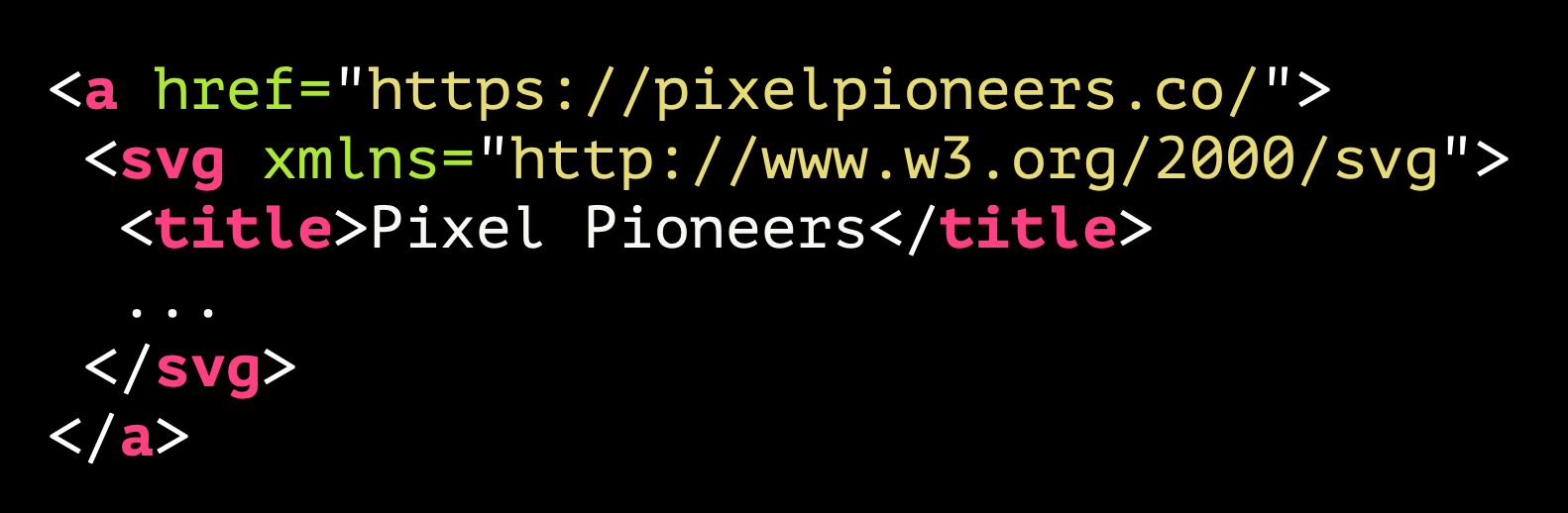
Seems fair. At least, if this were in the context of, say, an article where you're discussing logo design. In the markup showing, we can see that it's applied to the <title> element inside an SVG. If it were an <img> element, that would be applied to the alt attribute.
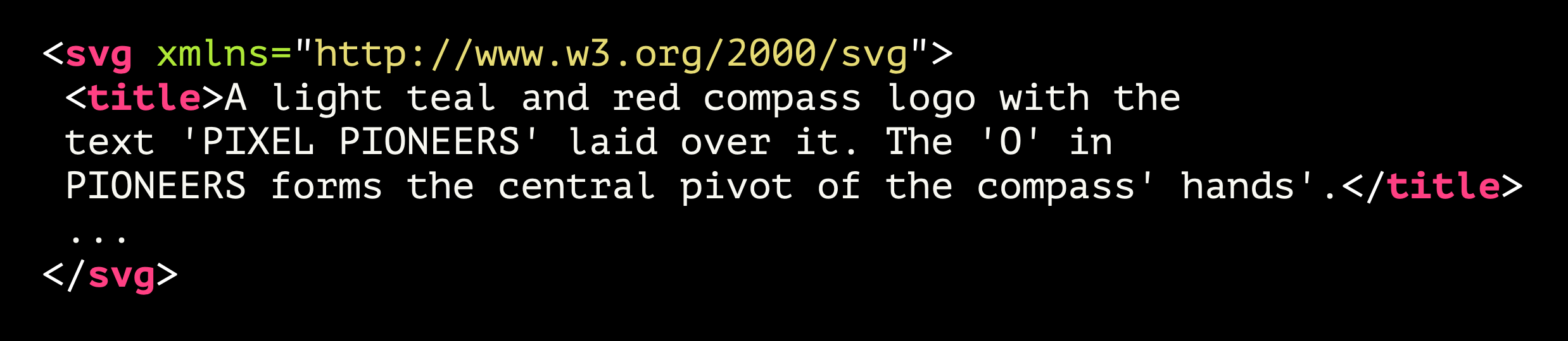
<svg xmlns="http://www.w3.org/2000/svg"
viewBox="0 0 946.99 370.43">
<title>A light teal and red compass logo with the text 'PIXEL PIONEERS' laid over it. The 'O' in PIONEERS forms the central pivot of the compass' hands'.</title>
...
</svg>
But what if it's a homepage link?
It's an image that is used in a link. Very typical usage. Now, does this still seem right?

<a href="https://pixelpioneers.co/">
<svg xmlns="http://www.w3.org/2000/svg"
viewBox="0 0 946.99 370.43">
<title>A light teal and red compass logo with the text 'PIXEL PIONEERS' laid over it. The 'O' in PIONEERS forms the central pivot of the compass' hands'.</title>
...
</svg>
</a>
Image alt is the link phrase
The problem now is that this alternative text is now providing the accessible name for that link. What does that link do? It takes you to the Pixel Pioneers homepage. What would a screen reader user hear? This:
Where's it going?
Well, that's not going to help is it? In this case, the image description is not really what we want. The alternative text should, instead, indicate the purpose of the link that it is inside.
<a href="https://pixelpioneers.co/">
<svg xmlns="http://www.w3.org/2000/svg"
viewBox="0 0 946.99 370.43">
<title>Pixel Pioneers</title>
...
</svg>
</a>
This is how it's implemented here, although I would suggest a tiny refinement:
I've just added the word 'Home' to the end to make it absolutely clear.
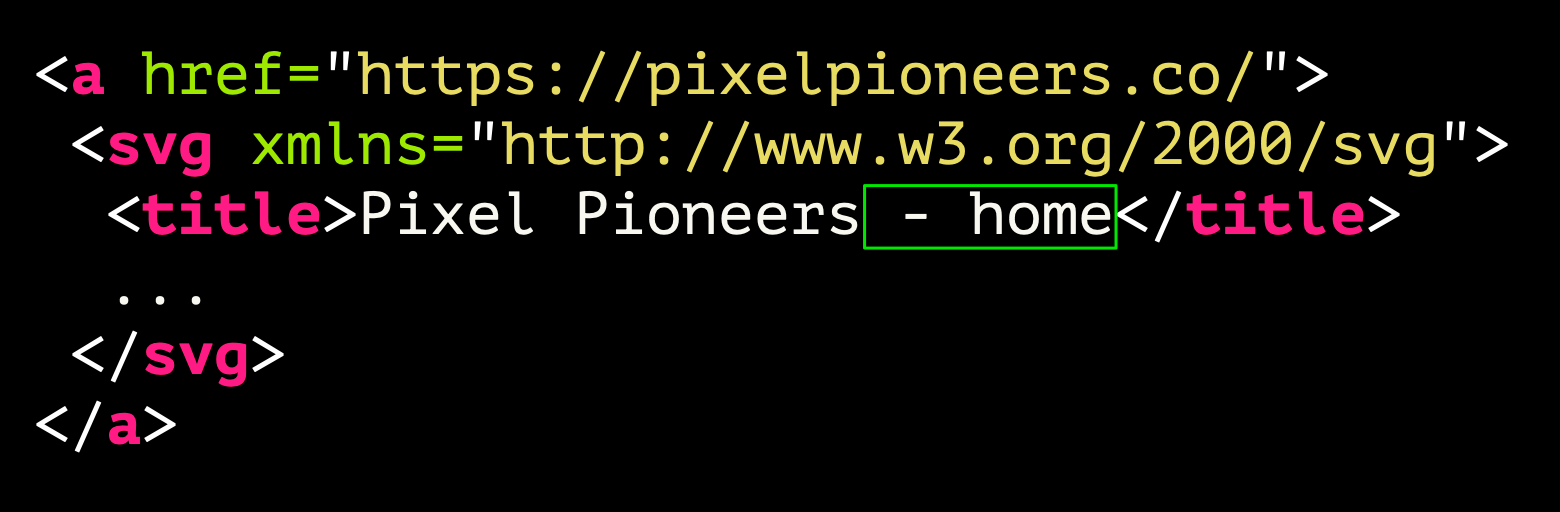
<a href="https://pixelpioneers.co/">
<svg xmlns="http://www.w3.org/2000/svg"
viewBox="0 0 946.99 370.43">
<title>Pixel Pioneers - home</title>
...
</svg>
</a>
Best of both worlds?
You could, however, achieve both aims by providing the short accessible name that indicates where the link goes and also provide a description. As with examples shown earlier, we can use aria-describedby for that:

<a href="https://pixelpioneers.co/" aria-describedby="logo_description">
<svg xmlns="http://www.w3.org/2000/svg"
viewBox="0 0 946.99 370.43">
<title>Pixel Pioneers - home</title>
...
</svg>
</a>
<div id="logo_description" hidden>A light teal and red compass logo with the text 'PIXEL PIONEERS' laid over it. The 'O' in PIONEERS forms the central pivot of the compass' hands'.</div>
When hidden is not truly hidden
Note that in this markup, the descriptive text is ONLY available to assistive technology users. The <div> it's contained in is set as hidden. It will not render on screen. However, hidden elements may be referenced using aria-describedby, so it's a safe approach. Now, screen reader users can get the quick link phrase but, depending on which screen readers they are using, they will either hear the description after a short pause, or they will be able to get the description if they choose it. In the following video, we can hear VoiceOver indicating that there is more content, which the user than then listen to:
Description is no longer a burden
So, that's the best of both worlds - the description can be provided, but it's no longer haranguing the user:
This Image, Yeah? Well, It's an Image!
If you're dropping an image into a page, please, PLEASE don't prefix it with "This is an image of ... whatever". Because, the thing is when you put an <img> into the document, it automatically exposes itself in the accessibility tree as an element with a role of image.
So the img element is equivalent to manually adding a role="image".
<img> --> role="image"
Or is it? At this point one or two of you might be wanting to yell out because there's an error in the example shown here. Feel free. Can anyone spot it?
Fun fact, the role that you would need to set to have it exposed as an image is "img" not "image".

<img> --> role="img"
Images exposing themselves
Anyway, the point is - you drop in an image, it is identified as an image, as the next video demonstrates:
So you don't need to say 'this is an image' in the alternative text, you're just adding to the verbosity.
The only time I might suggest that you should add phrases like this is where it truly is relevant. For example, if a blind person were looking to buy a gift card for someone, they might want to know if the image was a watercolour, or line drawing or a photo, so. you could describe the kind of image that is. But you absolutely do not need to describe it as an image.
Your help is not needed, Janet
There's Janet, desperate to help again ... and being shut out. Her help is just not needed here.
What the Focus?
Here's another misconception that I come across more often than I'd like. And it's this:

This is the belief that for content to be accessible for screen reader users, everything needs to be focusable. Because how else will a keyboard only user navigate around the page? Let's find out how wrong that is with a classic example - a table.
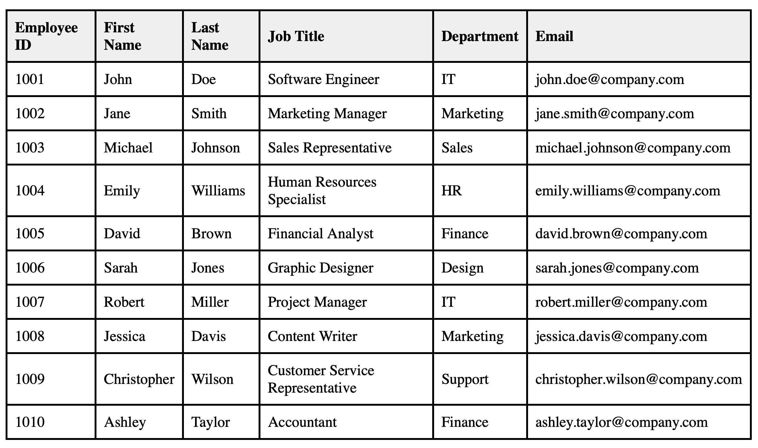
Table Genius
Here we have a typical table of employee details.
And here we have the first row of that table with tabindex applied to every cell. Every damn cell in every damn row.
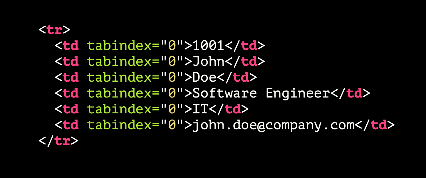
<tr>
<td tabindex="0">1001</td>
<td tabindex="0">John</td>
<td tabindex="0">Doe</td>
<td tabindex="0">Software Engineer</td>
<td tabindex="0">IT</td>
<td tabindex="@">john.doeacompany.com</td>
</tr>
How bad can it be?
Let's see and hear just how bad an idea this is:
Note that to get from a focusable element before the table to the next focusable element after the table took 61 TAB keypresses. For keyboard-only users—which the great majority of screen reader users are—this is the opposite of being helpful.
Just keep it simple
All we really need to do is this:

<tr>
<td>1001</td>
<td>John</td>
<td>Doe</td>
<td>Software Engineer</td>
<td>IT</td>
<td>john.doeacompany.com</td>
</tr>
Remove the tabindex attributes. Simple! And would you look at that: jumping past the table with the TAB key is easy. Meanwhile, the table is perfectly navigable with a screen reader using arrow keys.
The same applies for headings, paragraphs—really any block of content that is non-interactive. It should not be focusable and tabindex should GTFO.
You Gotta Role With It

Some of you may be thinking at this point, but there are situations where you do genuinely need to add a tabindex to a generic element. For example, you may be creating a custom select element, because it is not possible to style the default HTML option. While it is always more preferable to use a native HTML element than to create your own custom one, there will be cases where the custom option is your only choice.
If you're using native interactive HTML elements—such as a <button>, <input> or <a>—the element's role is automatically conveyed to assistive technology users. Remember the example of the image, where we don't include "Image of" in the alt text?
But if you're creating something from a humble <div> or <span> element, just remember that you need to specify the element's role. Because while you can visually style something that suggests a certain interaction, a blind screen reader user won't get that cue; all they will know is that they have tabbed to a thing on the page, so presumably it does something. Providing a role will manage some users' expectations about what they can do with that thing.
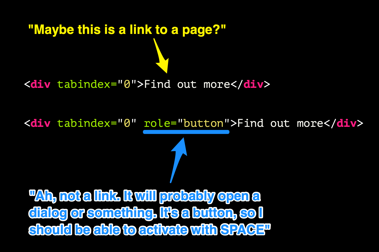
<div tabindex="0">Find out more</div>
"Ah, not a link. it will probably open a dialog or something. It's a button, so I should be able to activate with SPACE."
<div tabindex="0" role="button">Find out more</div>
I Like to Move It Move It
Another word of caution regarding focus issues. There are times where it is valid—and expected—that the user's focus should be moved on their behalf. For example:
- Opening a dialog - focus moves from the trigger to the dialog or interactive element inside
- Form errors - moving user back to field entered incorrectly upon submission
But should you move it, move it?
Sometimes, though, we see instances where focus is moved and it seems like it might be useful, but ends up causing more pain.
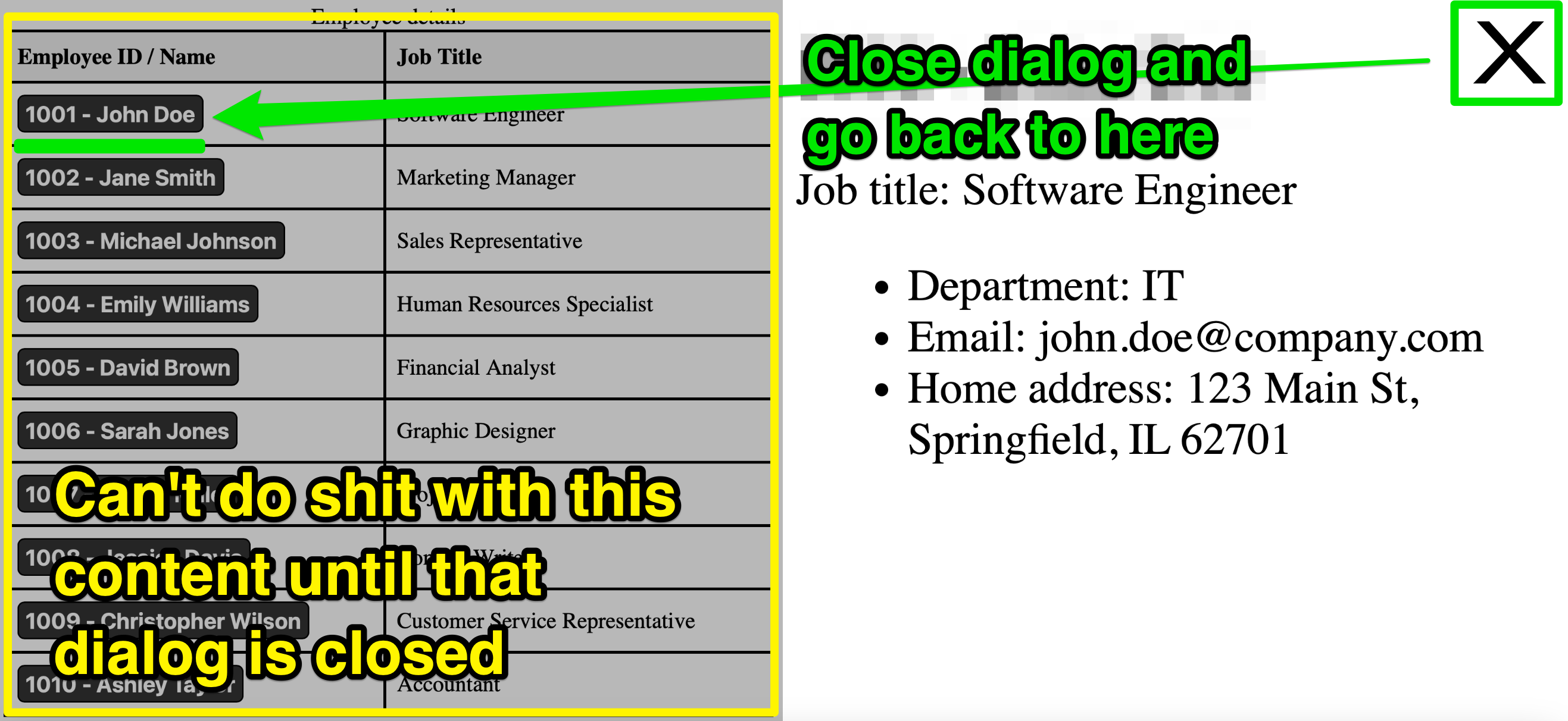
Let's take a look at our company employee database again. This time the table is simplified and only shows the employees names and job titles. All the other information is shown in a panel to the side when needed, like this:
Note that in the example here, it's just me using the mouse. I click a thing, it shows the details immediately on the right side of the screen.
Now let's see the keyboard-user's experience, and with a screen reader running:
That seems OK, right? The focus has moved to the heading for this newly revealed content. The screen reader has read out the text that's been shown. But what if I wanted to check other employees details? Let's say that I need to now check the second person's details. Well ...
1 step forward, 9 steps back
That's a lot of back-tracking for a keyboard user!
Once again, this helpful approach is not exactly welcomed with open arms:
Alternative 1: Don't shift focus
So how might you approach a UI like this? Instead of moving focus, leave the users's focus on the button that they just clicked. For screen reader users, the display of that text can be handled by using live regions. When a live region is updated, the change of content will be announced. Here's a different version of that tool. Note that I am free to navigate through the buttons and display the text without then having to SHIFT+TAB back through multiple controls to get where I came from:
Alternative 2: Implement as dialog
Another option would be to treat that content on the right as a modal dialog whereby you can only get back to the main table content by closing that panel. That way the focus can be properly managed, and move you back to the control you previously selected.
Wrapping up
To summarise everything that I've just said then:
- Any time you are adding an attribute that starts with
aria-, question whether it's really needed - If it is needed, check that you've not actually caused issues for assistive tech users
- Always favour native HTML over custom elements where you can
- If it's complicated to make it accessible, maybe it's too complex for everyone
Don't be like Janet
Whatever you do to help improve the accessibility of your web content and interfaces, be sure to test as much as you can to make sure that your help is not as welcome as Janet's constant interventions.